Visual Systems
March 2024
Radiant Renewable Solar Energy Solutions
Radiant Renewable Solar Energy Solutions approached us with a critical challenge: to reinvent their brand identity to stand out in a highly competitive and technical industry. Our goal was to create a cohesive visual system that balances technical credibility with human warmth, fostering trust and emotional connection with both residential and commercial clients. This case study details our strategic process, creative solutions, and measurable impact.
Renewable Energy Branding
Services
Full Brand Strategy, Logo Design, Marketing Collateral
Category
Energy & Sustainability
Client
Radiant Renewable Solar Energy Solutions


Breaking Through Solar Industry Noise
The solar energy sector is saturated with brands that rely heavily on clichéd blue palettes and overly technical visuals, often alienating everyday consumers. Radiant’s previous brand identity was no exception—it lacked differentiation and emotional resonance. Their logo was generic, and their messaging was too technical, making it difficult to connect with homeowners and small businesses seeking approachable, trustworthy renewable energy solutions.
Additionally, Radiant struggled with inconsistent branding across digital platforms, which diluted their presence and confused potential customers. The lack of a clear brand architecture made it difficult to communicate their diverse offerings, from residential solar panel installations to large-scale commercial projects.
Key Obstacles
Inconsistent tone and messaging across social media and marketing materials.
Absence of a unified brand system to address varied customer segments.
Visual identity failed to stand out against legacy energy companies.
Sunlight Meets Strategy: Our Brand Approach
Our strategy was to develop a dual-axis brand system that would simultaneously convey Radiant’s technical expertise and their commitment to approachable, sustainable energy solutions. This approach allowed us to craft a brand that appeals both to engineers and everyday consumers.
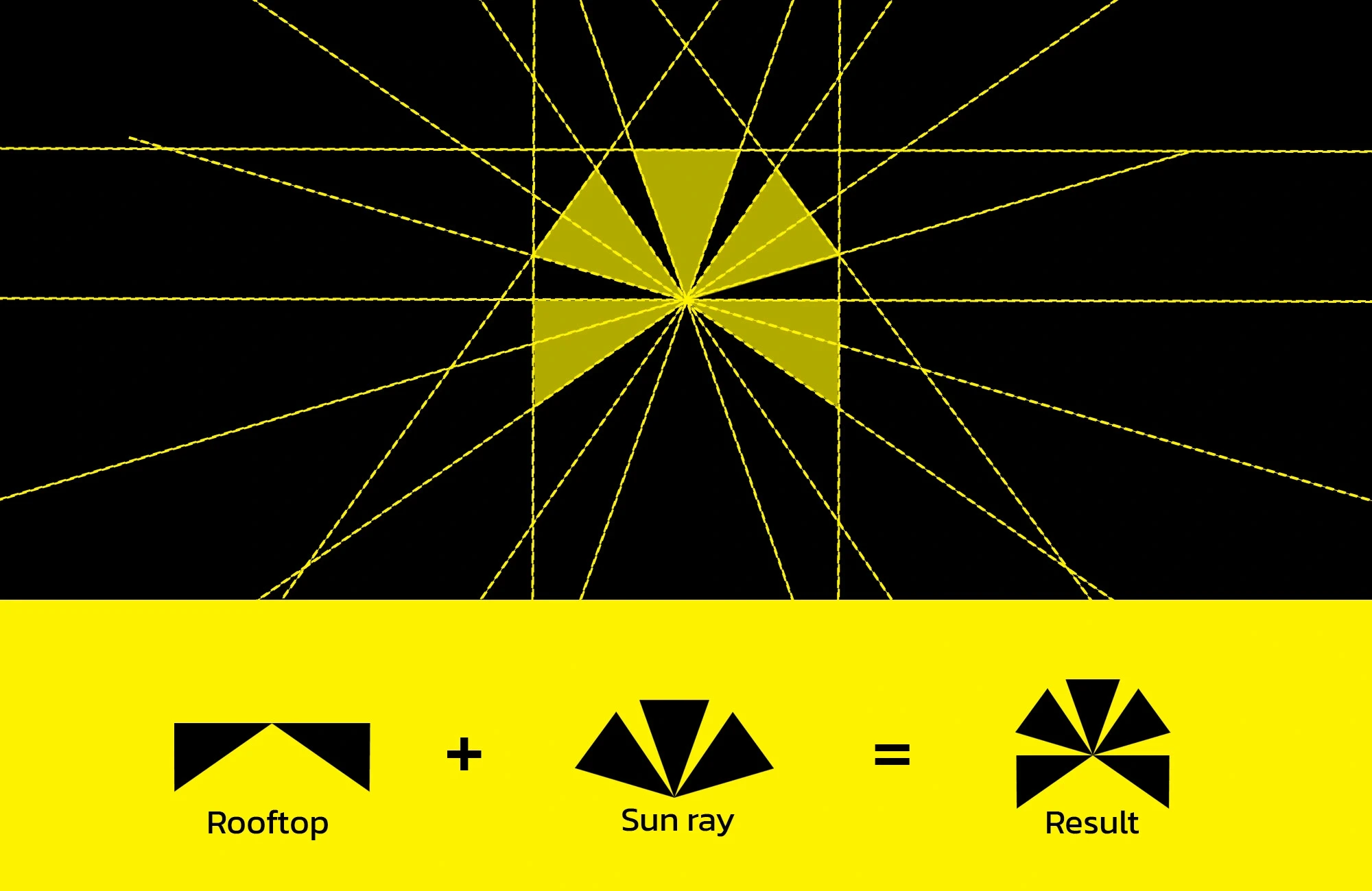
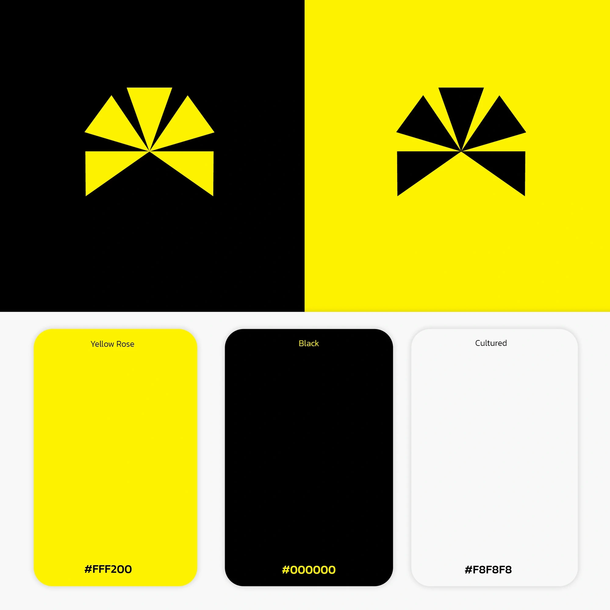
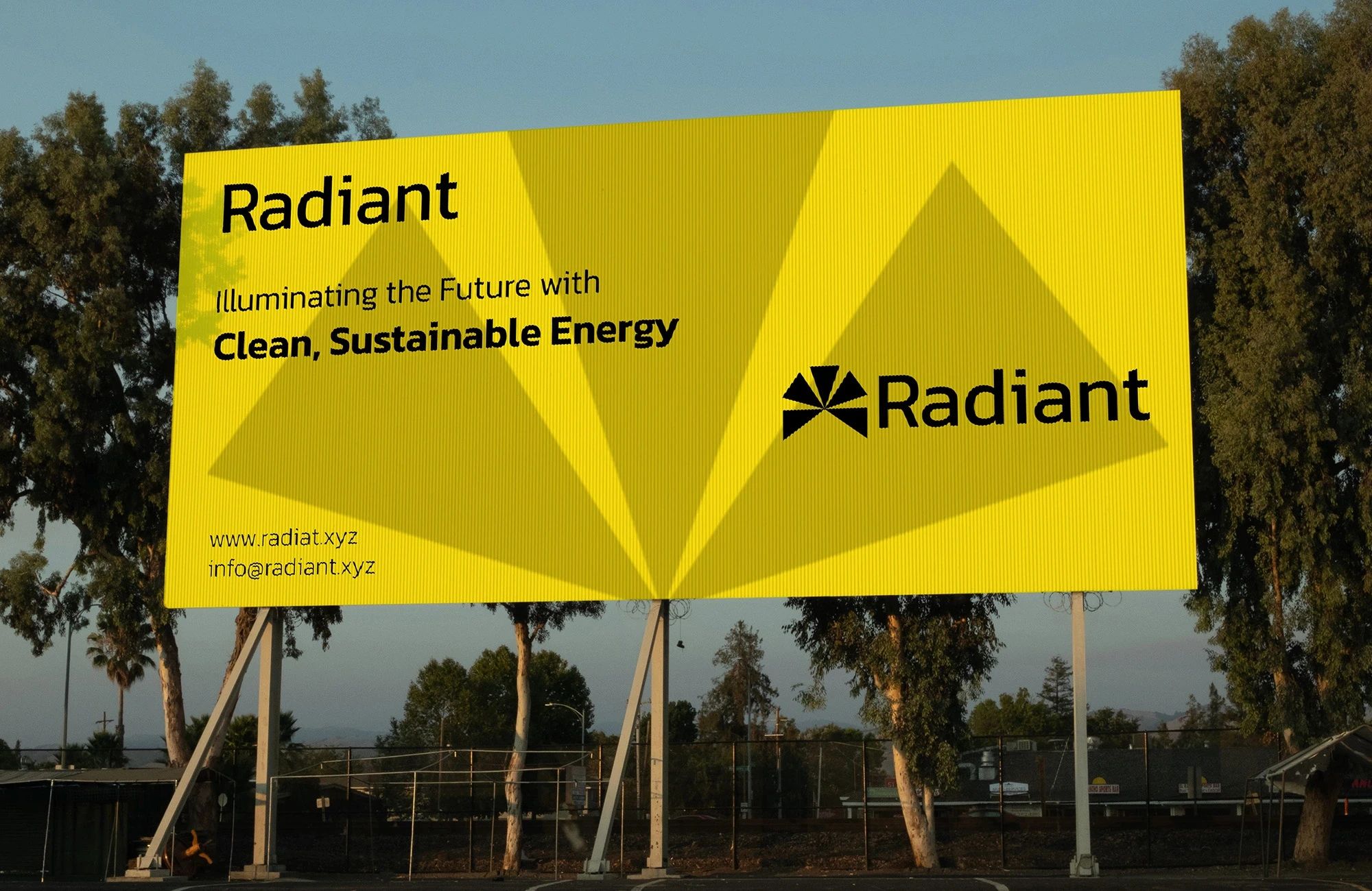
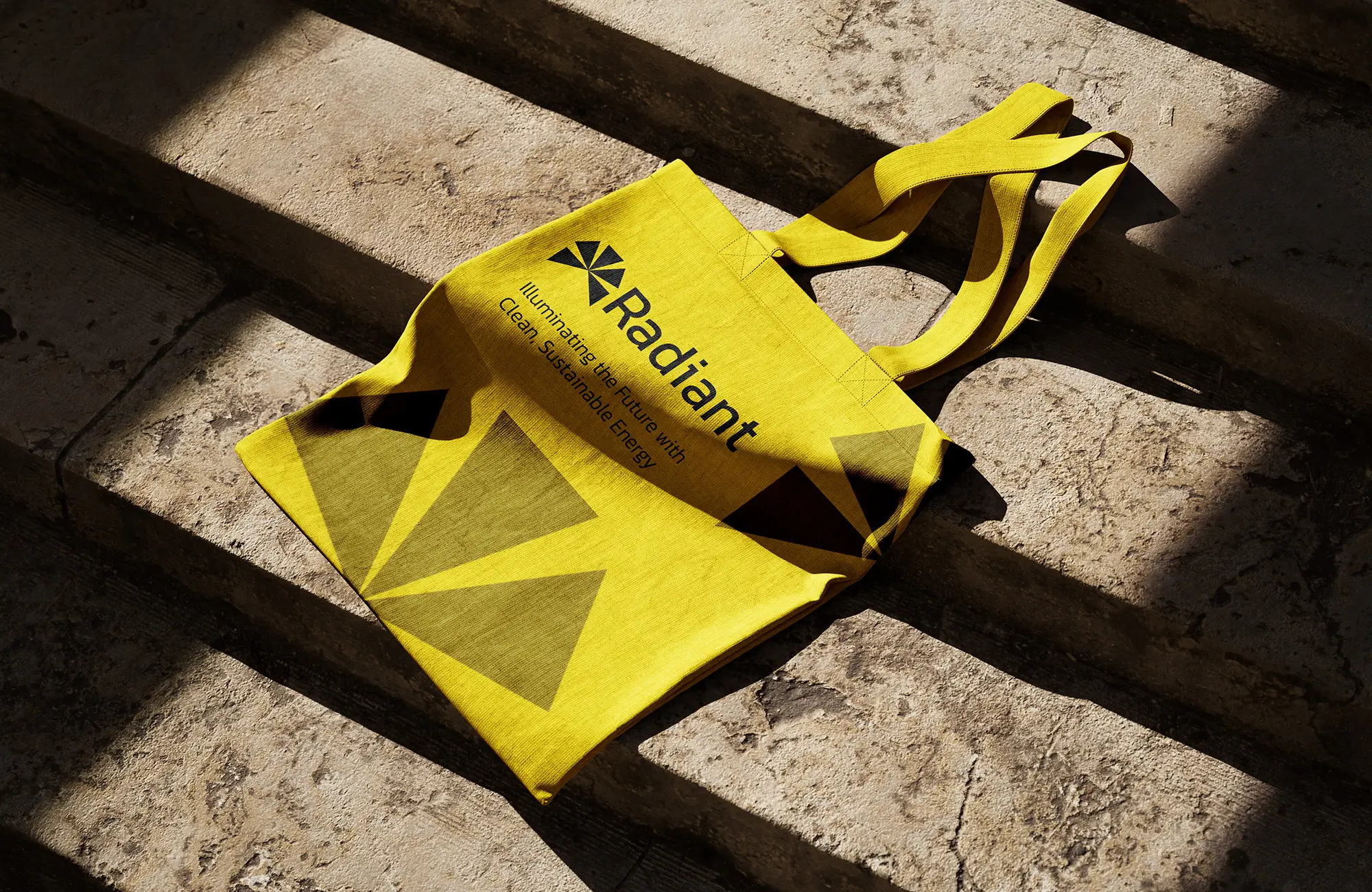
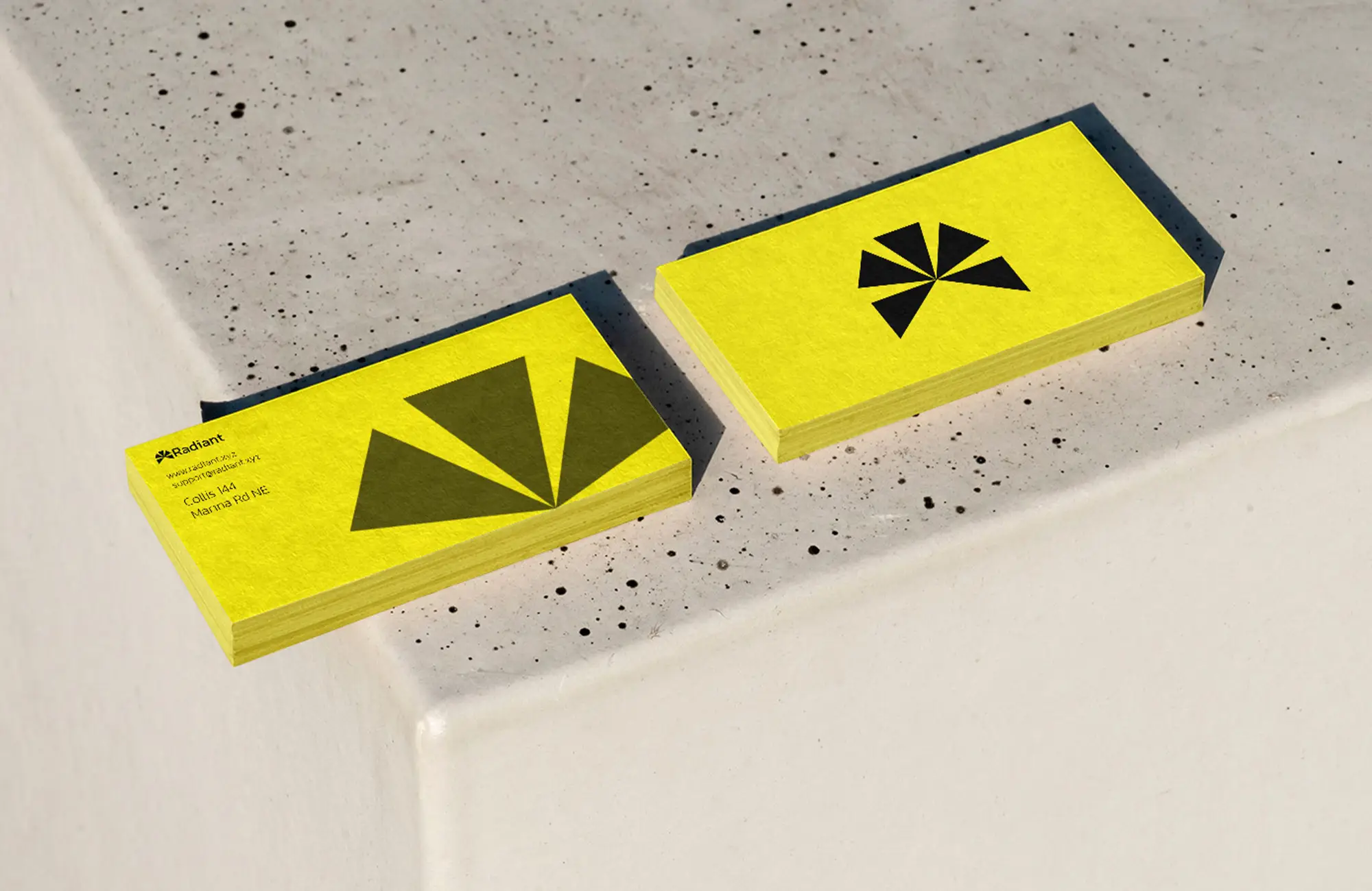
Technical Trust: We designed a logo inspired by the geometry of solar panels and circuit boards, using clean lines and precise shapes to communicate innovation and reliability. The color palette combines a vibrant Sunrise Orange (#FF6B35) symbolizing energy and optimism, with a Trustworthy Navy (#2A3D66) that anchors the brand in professionalism and stability.
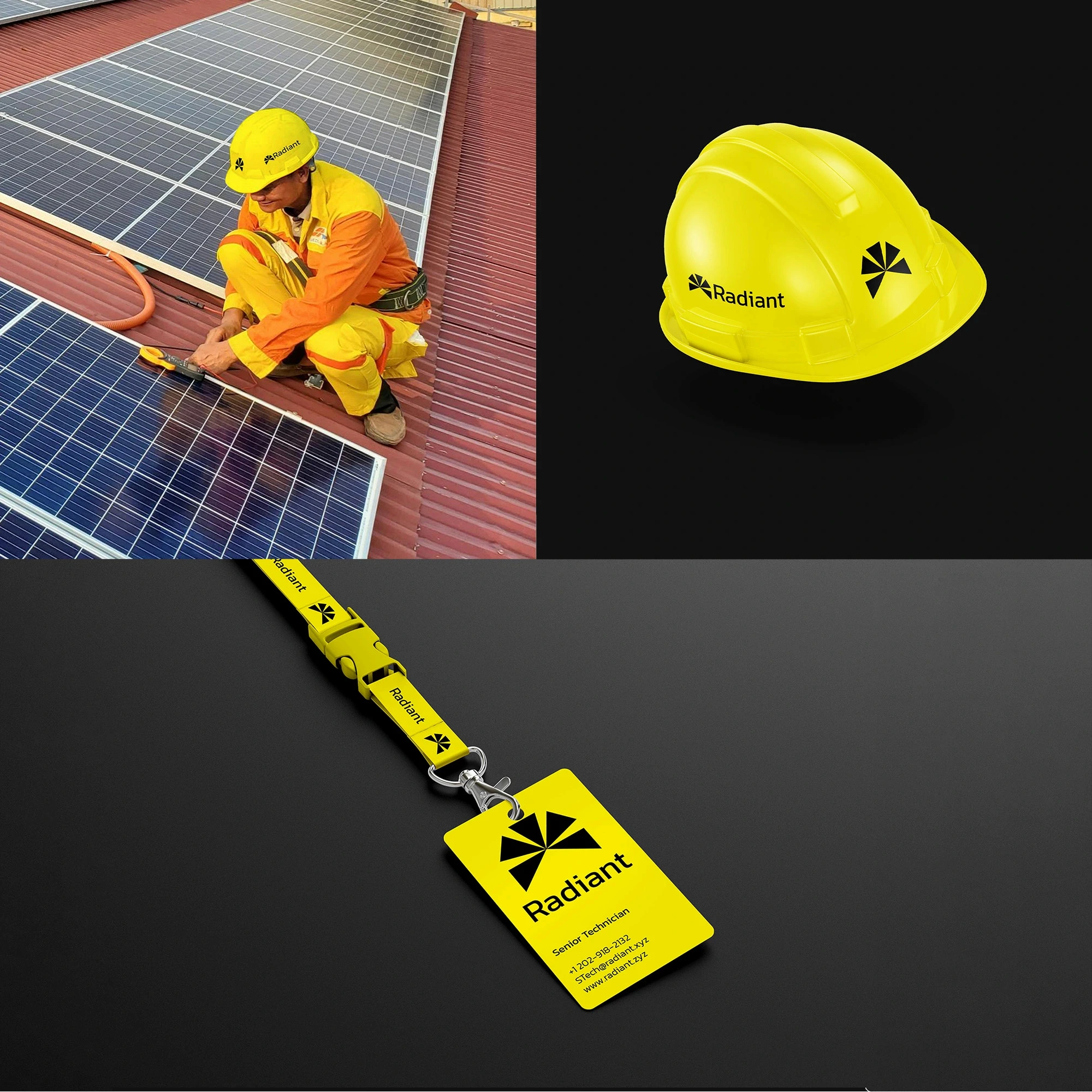
Human Warmth: To balance the technical elements, we introduced organic textures and aspirational photography depicting real families and businesses benefiting from solar energy. Typography choices paired the modern, tech-forward Space Grotesk with the warm, readable serif Lora, creating a harmonious visual rhythm.
Core Identity Elements
Logo combines sun rays and circuit board motifs for a unique symbol of innovation and sustainability.
Color Palette: Sunrise Orange (#FF6B35) + Trustworthy Navy (#2A3D66) with supportive neutrals.
Typography: Space Grotesk for headlines and Lora for body text, balancing modernity and approachability.
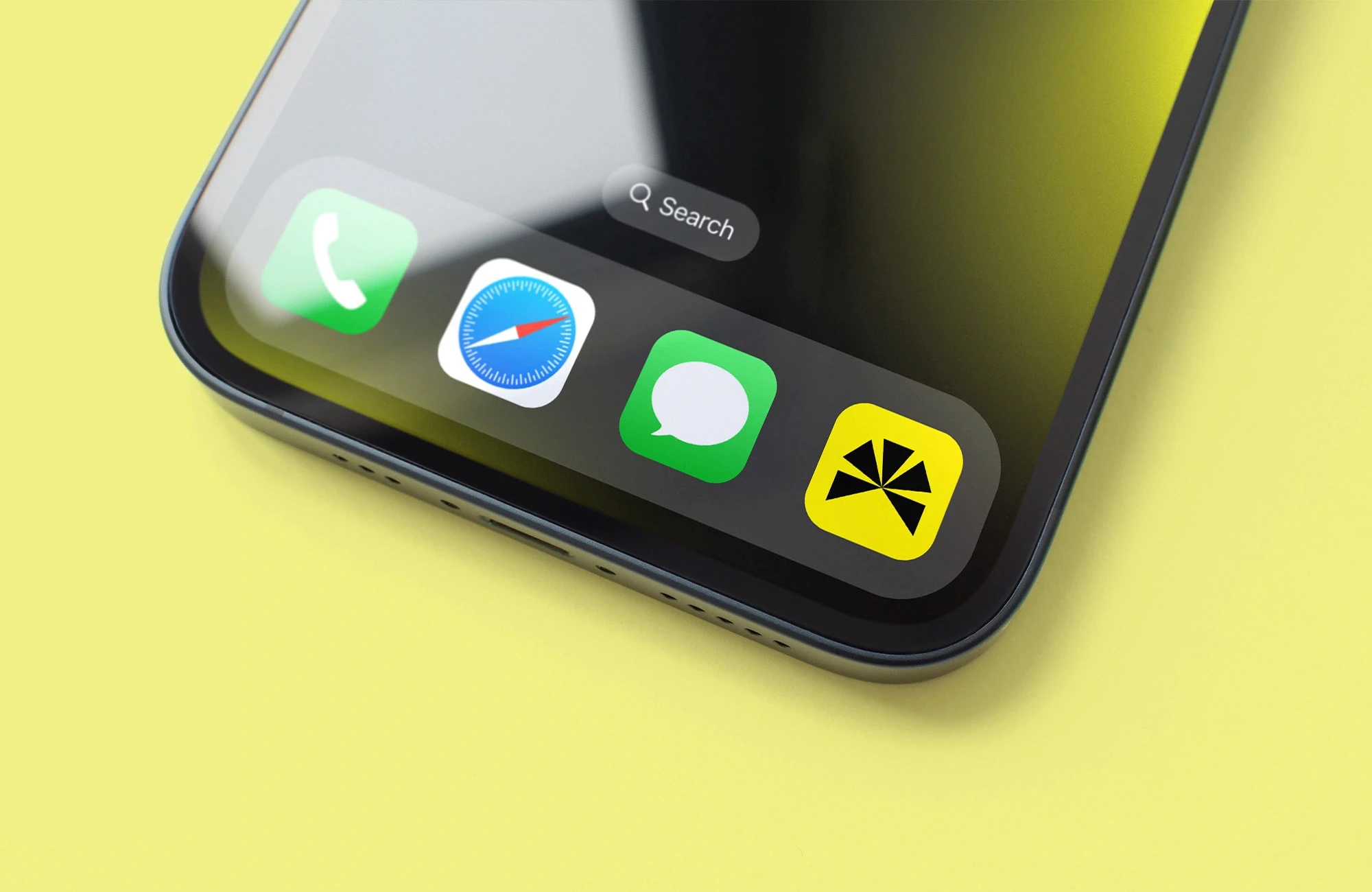
Iconography: Modular patterns inspired by solar cells, adaptable across digital and print collateral.
Brand Architecture: Created clear visual cues to differentiate residential and commercial services within the same system.
Illuminating Business Growth Through Branding
The rebrand delivered significant, measurable results within six months:
Lead Generation: A 217% year-over-year increase in qualified leads during Q3 2024, driven by improved brand recall and trust.
Website Engagement: Average session duration increased by 45%, indicating visitors found the site more engaging and informative.
Social Media: Engagement rates rose by 68%, with consistent messaging and refreshed visuals driving community growth.
Industry Recognition: Radiant was shortlisted for the 2024 Clean Energy Brand Awards, validating the strategic and creative excellence of the project.
Quantitative Wins
+217% YOY lead growth, 45% longer website sessions, 68% higher social engagement.
Strengthened brand positioning against legacy competitors.
Clear, consistent messaging across all touchpoints.
Enhanced customer confidence and loyalty.


How We Work?