Concept Build
2026
ASTRAL-01 Modular Audio Brand World
ASTRAL-01 is a complete brand world for a modular premium-audio concept built against disposable luxury. Vizualogy developed the positioning, identity, product narrative, visual system, art direction, and digital flagship as one coherent ecosystem—tactile on the outside, transparent at the core.
Brand System
Services
Brand Strategy, Identity & Art Direction
Category
Consumer Audio & Hardware
Client
Vizualogy (Internal Concept)


Designing a Brand Built to Survive the Hype Cycle
Premium audio is crowded with products that look polished for one launch moment, then disappear into the same language of anonymous metal, soft gradients, and planned replacement. ASTRAL-01 needed to feel collectible without becoming ornamental, technical without becoming sterile, and futuristic without depending on short-lived visual trends.
The Concept Objective
Premium audio without premium disposability.
The objective was to build a boutique hardware brand that could move from investor deck to product page, packaging, campaign, and interface without losing its logic. Every decision had to support the same position: studio-grade sound, modular architecture, and components designed to be seen, serviced, and kept.
The Object
The product begins with a crystal-clear polycarbonate shell that exposes its internal construction instead of hiding it. An aerospace-aluminum chassis gives the object structural permanence, while the modular ear-cup architecture turns maintenance and upgrades into part of the ownership experience rather than an afterthought.

Three Layers. One Coherent World.
Brand, product, and digital experience were designed as three connected layers. The identity borrows the discipline of 1970s industrial design, the tension of 1990s Tokyo aerospace, and the exposed construction of contemporary transparent technology. The result feels premium without falling into generic luxury.
The Visual System
Retro-futurist brutalism with exposed logic.
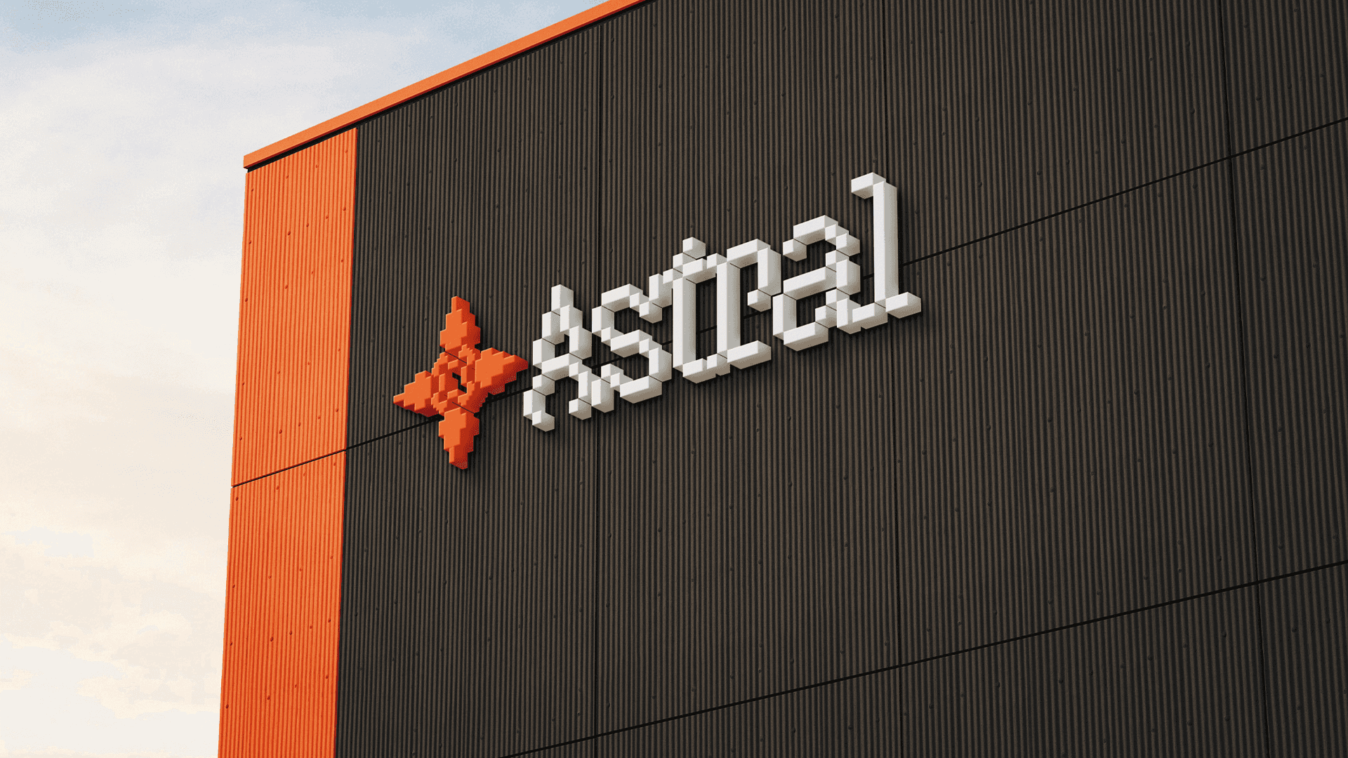
A pixel-built mark rotates a single A into a four-point reticle, encoding repetition, control, an exposed center, and early-digital precision. Bankara Grotesk is reserved for expressive display moments, while Space Grotesk carries the functional system. Orange-red acts as the signal against solid black, tender white, and engineered neutral grays.

A Digital Flagship That Feels Like the Product
The digital flagship translates the object’s construction into an immersive retail story: overlapping type, layered imagery, technical annotations, product variants, and cinematic pacing reveal the headphones as both instrument and artifact. The interface remains legible and conversion-ready while preserving the identity’s uncompromising edge.
Semantic Structure & Storytelling
Every frame assigned before it was shot.
The photographic system was planned before generation: Y2K Japan, Kodak Portra warmth, controlled orange illumination, and exact aspect ratios for each layout placement. That preparation keeps every campaign frame consistent and lets the complete project read as one authored world rather than a collection of disconnected mockups.
How We Work?